saar media
SERVICES: BRAND COACHING | ART DIRECTION | BRAND STRATEGY + STYLE GUIDE | GRAPHIC DESIGN
-
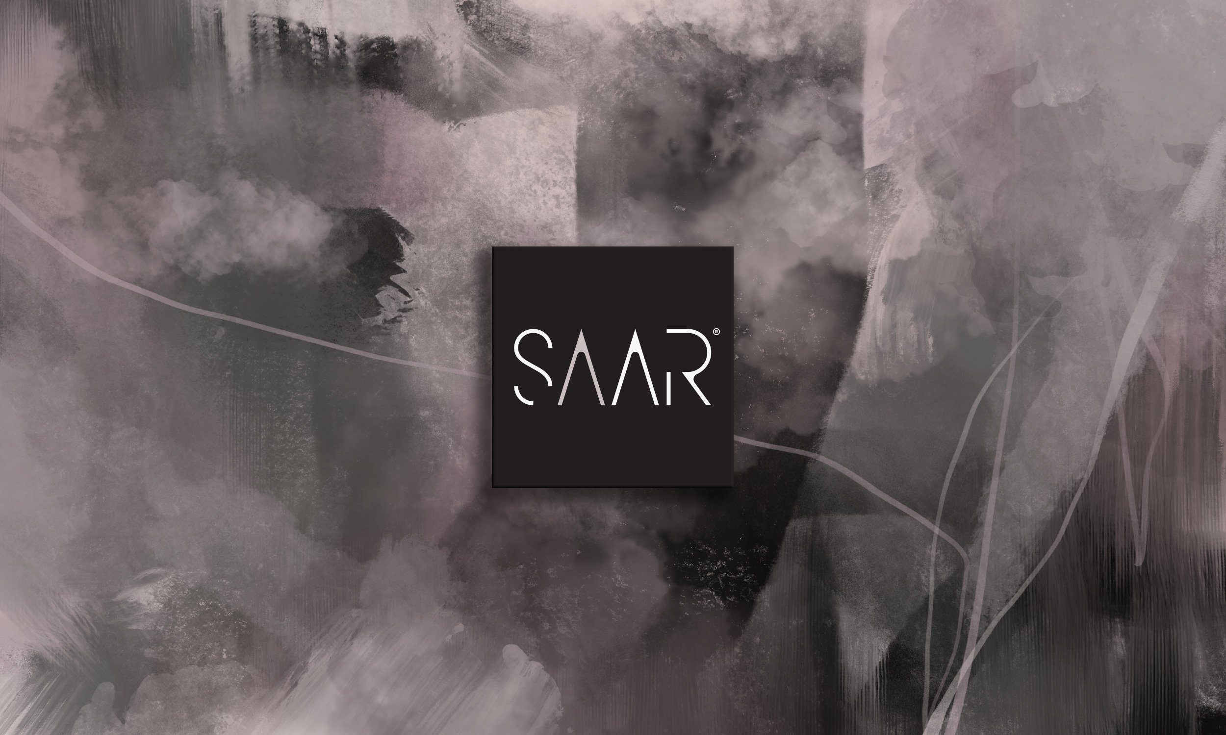
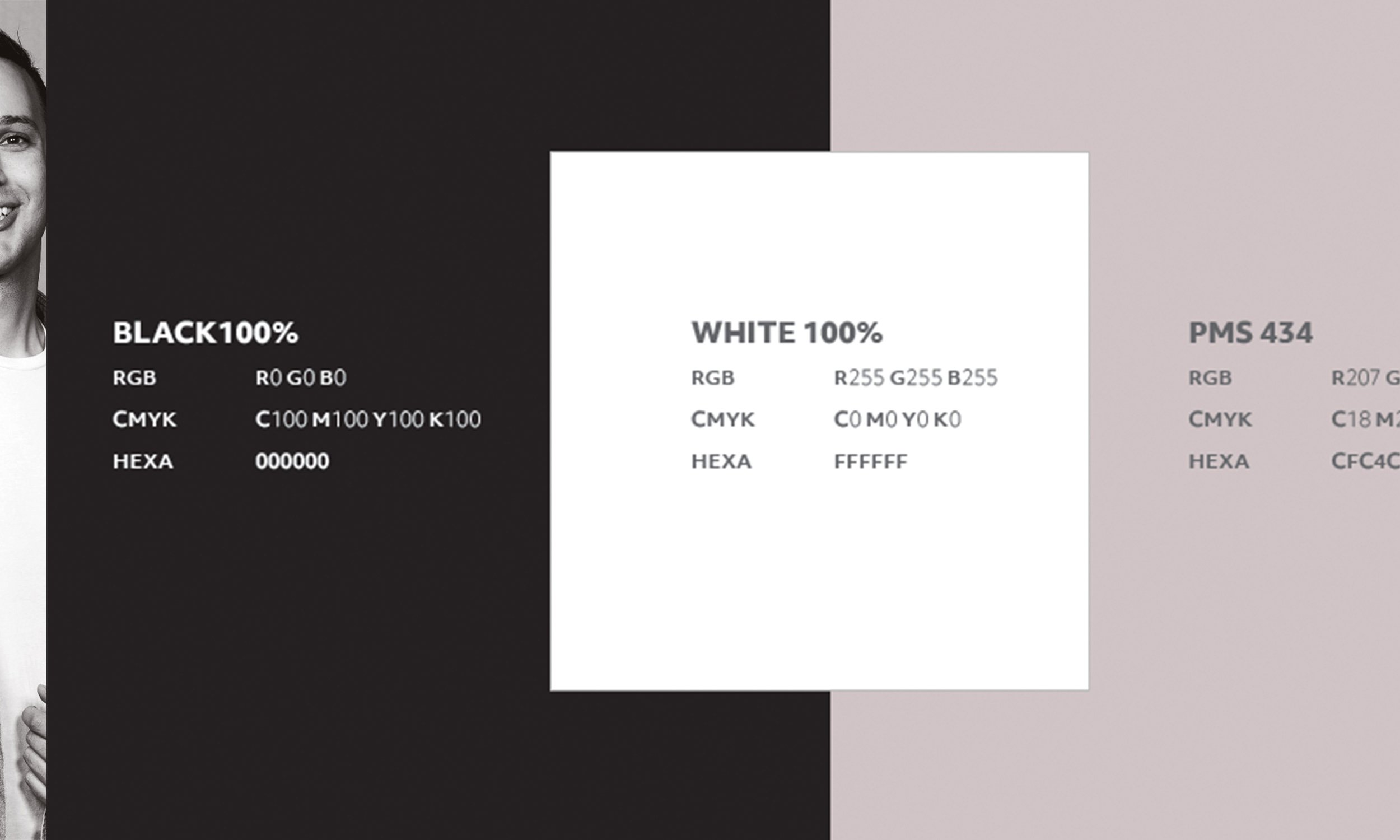
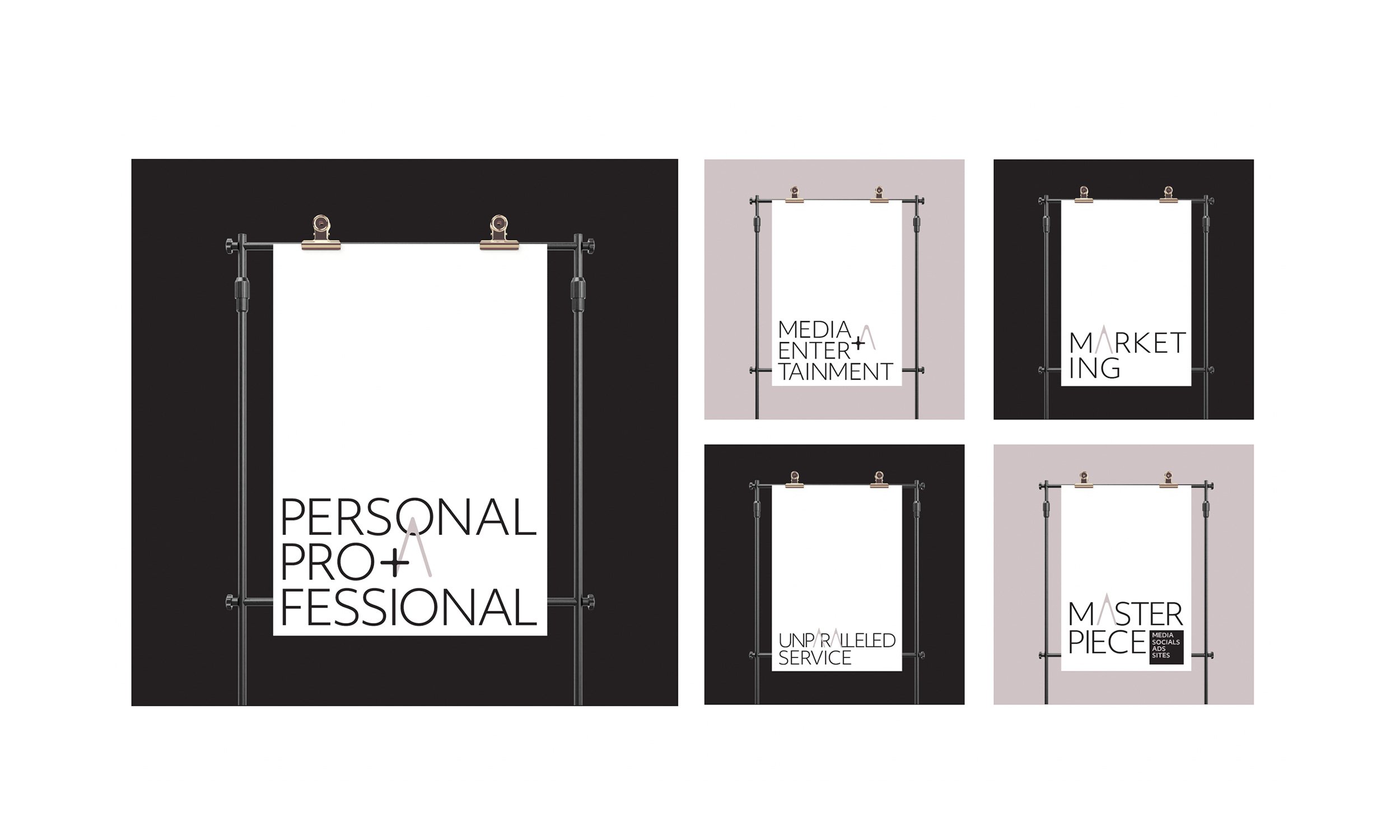
Collaborating with a series of various SAAR Media clientele, developing their new Brand Identities and Style Guides, it became clear that SAAR needed to refresh their own brand by tweaking the existing logo ID to reflect a more elegant and intentional look to their overall brand assets. In our discussions with Dav the Director of SAAR, the logo as its entry mark wasn’t our issue - it was a matter of focussing on how to extract symbolic memorable branded cues within their identity. We believe the way you use your symbols can be more compelling when it comes to buying decisions and effective digital marketing communications. We also considered changing the colour of the A - a Smokey Pink hue - to represent the warmth and connections SAAR’s ideal clientele bring to each works and collaborative process. The first “A” in SAAR represented by the client A Class interaction. The option for this colour to be changed based on digital marketing and advertising is allocated also. Quadtone colourings to the imagery, rather than a monotone B/W - distinctive from other media marketing agencies and connects with the A in SAAR. The sans serif secondary font - for clear focus on simple yet effective marketing that can be easily read and seen on a wide range of digital platforms. We believe a brand should be charismatic and use strong branded aesthetic features. Providing SAAR with a Brand Deck | Style Guide and an abstract of digital art for its backgrounds, enables their designers and marketers to consistently execute and carry out all their brand assets and marketing material.